B2Chat reports 📊 help you better understand your company's performance. Each one of the different reports details specific aspects of chats, departments, agents, messages, transfers, and especially the time these processes take for your business.
Learning to read 🤓 reports correctly will help you make more accurate decisions with regard to your business's direction, thus increasing the productivity of each one of your channels. The reports module is also an excellent evaluation tool, thanks to it you can identify the effectiveness of your new: services, products, or ideas, comparing results 🔎 and time flow you can determine how significant a certain action has been for your brand.
Finally, reports can be very useful in the advertising field. Comparing results 🤔 after a campaign will help you identify the return on investment 💲 and in this way, decide if it can be repeated in the future or if it should be modified.
In conclusion, B2Chat's reports module is a powerful 🗺️ guide for your company, learn how to use it in this article and begin enjoying its benefits:
Now, we'll explain the general structure of B2Chat's reports module
To access the Reports module all you need to do is click on the main menu and head to My Reports, where you will find a list of different reports that you can consult online.
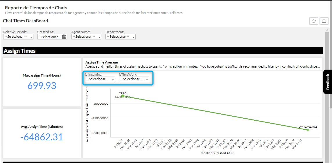
Once inside the module, you will find a series of filters located at the top, these filters (relative periods, Created alt, Agent Name, State, Channel, Department, is_incoming) will help you refine your reports, including only the data that you are interested in analyzing:
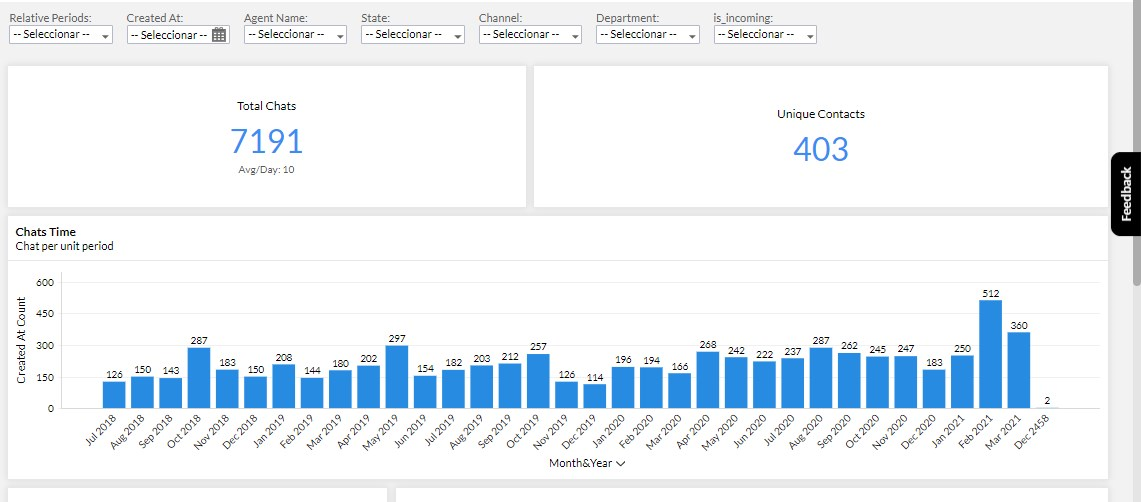
Each DashBoard will have different types of reports, among which the following stand out:
- Indicators
- Pie type reports
- Bar Reports
- Line graph reports
- Table view reports
Now that we understand what the structure for the B2Chat reports looks like, we can begin to explain the general functionalities that you will find in all DashBoards as well as the general functionalities for each of the reports that make up the dashboards.
1. Dashboard overview:
1.1 DashBoard filters: With the filters that you will find in the upper section of all the DashBoards, you will be able to carry out specific searches, which will apply to all the reports that the DashBoard contains and thus generate reports according to your needs:

Each Dashboard will have different filters according to the data for each one.
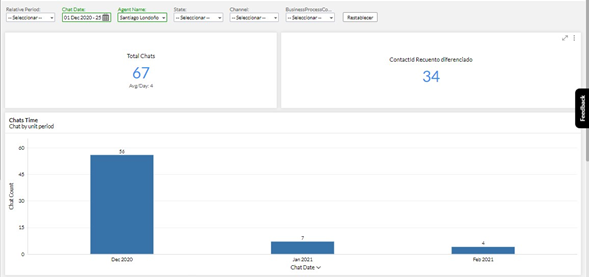
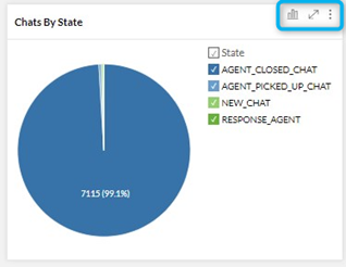
Once you filter a Dashboard, you will see that all the reports are updated according to the selected filter. Below, we provide an example with the Chats Dashboard, we filter by a specific date, with the name of one of our agents and the system shows us by default all the conversations with which the filtered agent interacted in the specific date range.
1.2. Export Dashboard:
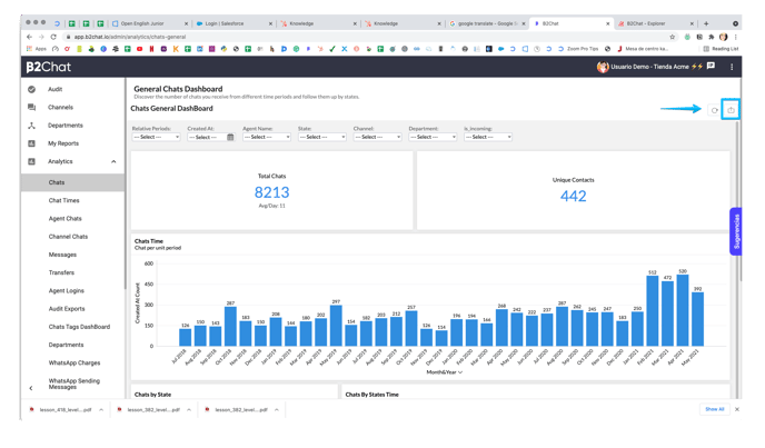
At the top right of all dashboards, you will find the option to export the complete DashBoard.
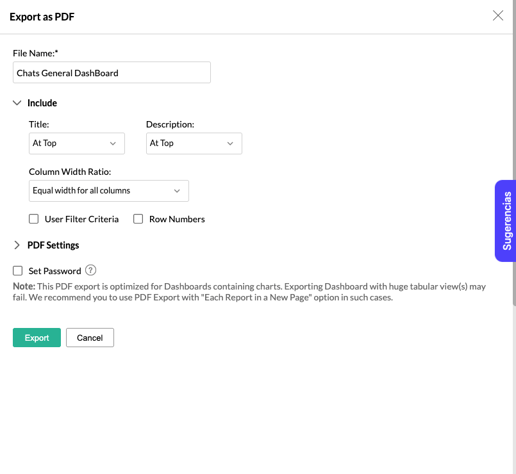
 The system will present you with three formatting options (PDF with the dashboard as it is seen on the screen, PDF with each report on a separate sheet, and finally in HTML format.)
 For each option, B2Chat will provide you with different configurations for the specific format, For example for PDF you will see these options.
3.1. Update Dashboard:
 With this button, you can refresh the Dashboard, so that the reports show you the updated data.
2. Reports generalities:
2.1. General options menu: In the upper right corner of each Report, you will find 3 options that we will explain below:
2.1.1. Change chart types
 With this icon, you can choose between the various graphs that we have available for you. When you click on it, a small menu is displayed with the different customization options:
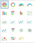
You can choose if your data is displayed:
- Circular
- Ring
- Semicircular graph
- Semi Ring
- Vertical bar
- Horizontal bar
- Histogram
- Dispersed
- Passed
- Line
- Line with markers
- Smooth line
- Smoothed line with markers
- Funnel
- Unfilled network graphic
- Network graph
- Bubble
- Bubble packed
- Table view
💡 Keep in mind that not all types of reports support all types of visualization. It depends on the reports' settings.
2.1.2. Maximize
 This option allows you to view your graph of choice in more detail and in full screen. If you wish to return to the default view, click on
  .
.
2.1.3. More options
 When you click on this option, a menu will appear with these two options:
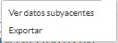
- See underlying data: In this option, you will be able to see all the data from which the report has been created. Later, we will explain in more detail all the options available in the underlying data list. View underlying data
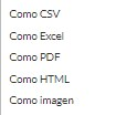
- Export: When you choose this option, a menu is displayed with the following export options:
Keep in mind that, exporting the generated file will show you the data grouped as configured in the report.
2.2. Explore the charts
This functionality is very important so that you can deepen the analysis of the information that the reports provide you.
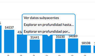
In order to analyze the data, you can click on any graph in any data grouping, for example, a month, an agent, etc. These groups are either a bar or a section of a pie, etc., our system will show you a menu from which you can display these three options:
- View underlying data
- Explore in Depth up to
- Explore in Depth by
2.2.1. View underlying data:
In this section, you will be able to see all the grouping data from which you started. Later we will explain in more detail all the options that are available in the Underlying Data list. View underlying data
2.2.2. Explore down to: This option only appears in reports where the x-axis is a timeline. And, it allows you to go in-depth to see the information grouped by a unit of time less than the current one. For example, if the report is initially grouped month by month when you click on it, it will show you the data grouped week by week for the selected month, and then if you click on it again it will show them day by day and then hour by hour.
2.2.3 Explore in Depth by: Now if what you need is to explore by another different variable, you can choose this option that will show you a menu with all the available variables to group the information like the following: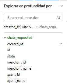
In which, you can choose the variable that best suits the way you want to group data for a specific data set. An example of what you can do with this option is: see chats grouped by all agents in a specific month.
To achieve this you can do the following: go to the search bar for the month you wish to see grouped by agents, select the option to export in depth by, select the variable (agent_name), and voila, you will have all the chats for that month grouped by agent.
2.3 Report filters: For some reports, you will see that they have additional filter options from the main filters in the dashboard that you find at the top of the screen; when you use them, these filters take precedence over the dashboard filters. These filters can be found in the Chat Times Report, WhatsApp Consumption Report, and WhatsApp Shipment Report among others.
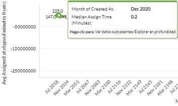
2.4 Viewing each point of the report:
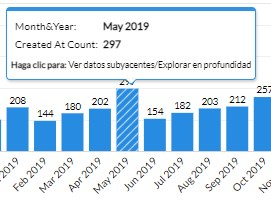
When you position yourself with the cursor without clicking on each bar or point of the data that each graph shows you, it shows you a floating window where it shows you the group of data on which you are located, the amount of data that was obtained from that group. The graphics that you have below are an example of this:
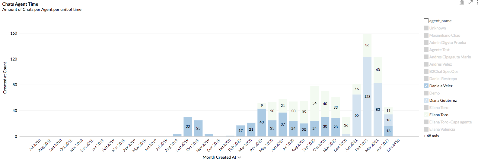
2.4 Visualization of data groups: When the report groups data by any variable, you can use the tool located on the right side of the graph, so that you can observe for each of the groups, marking or unchecking the name of each one of them to display them or not in the report:
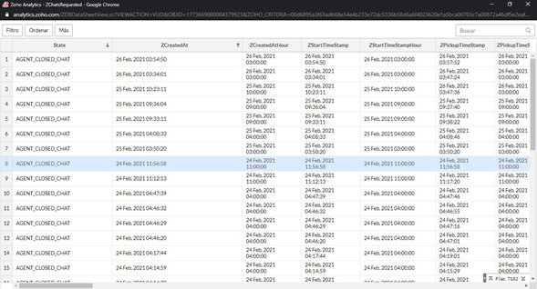
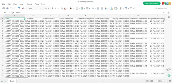
See underlying data: With this option, a new window is displayed where you can view your search results in a more thorough way; and where you can view all the data and records for the selected report. This will help you export it and process it with other analytical tools. Here is an example of the Chats table that comes out of the Chats DashBoard.
Within this screen, on the upper left-hand side, you have at your disposal these options:
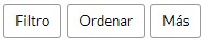
We will tell you what each of these options consists of below:
Filter: A filter appears, where you can choose the data you want to filter, from each of the columns displayed on the screen.

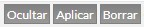
After choosing the data for your search, according to your needs, click on the buttons shown in the filter:
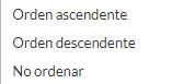
Sort: With this button, you can choose the way the information is organized:
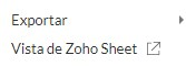
More: This button shows you the export options that we have made available to you, in addition to this, the Zoho Sheet View option, where you have a Web spreadsheet, in which you can better manage your search data.
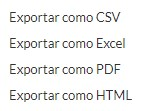
Export options:
Zoho Sheet spreadsheet:
This way, you will be able to understand the dashboards' general functionalities and reports through B2Chat so that you can take full advantage of each one of them. 😊